Seven engagements. One discipline.
Advocacy, real estate, coffee, watches, insurance, and a satirist. The industries differ; the standard doesn’t.






Georgia Affordable Housing Coalition
GAHC exists in the unglamorous part of housing work, the part where a single line of tax policy can decide whether an affordable development pencils out or dies on the vine. In 2025, the math was turning hostile: a technical quirk in Georgia’s tax mechanics had quietly started landing like a penalty on the very projects meant to ease the housing crunch, in some cases past seven figures on a single development. Yet the larger problem wasn’t only the cost. It was that no one could explain it cleanly.
That’s how advocacy loses: not because the issue isn’t real, but because confusion creates distance, and distance looks a lot like apathy. People can’t fight what they can’t name.
The work began with GAHC leadership, the lobbyists carrying the bill, and communications partners, locating the plain-English center of gravity. Out of that clarity came a single banner strong enough to hold the story: Taxed Out. It named the condition in two words and reframed the issue as a tangible threat to housing supply rather than an abstract accounting problem. The narrative was designed to be repeatable on purpose, so every partner could say the same true thing in the same order.
A flexible identity and visual language gave Taxed Out a consistent presence across touchpoints. Video and content were shaped for distribution first, social feeds, paid placements, inboxes, and a campaign site anchored everything as the single source of truth.
The proof of life showed up in how the coalition began speaking: instead of fragmented explanations and “well, it’s complicated” disclaimers, the ecosystem moved with one voice. The legislative outcome is still pending, but the transformation is already visible, when the vote arrives, the narrative won’t need a translator. It will already be in the room.
Reservoir was built on a conviction most companies keep politely private: that business can be a serious instrument of ministry. A commercial real estate investment and services company directing the fruit of that work toward missions, ministries, and nonprofits. The risk was immediate: when your “why” is loud and your “how” is quiet, the market fills in the blanks.
Their faith-forward posture could read as vague to investors who need clarity, or overly spiritual to partners scanning for professional credibility. Without a shared narrative, the same company can accidentally introduce itself as four different entities, and credibility erodes one conversation at a time.
The messaging took shape around a simple insistence: Reservoir doesn’t “support good causes.” It funds impact through disciplined commercial performance. Real estate is not adjacent to the mission; it’s the mechanism. The work mapped the investor and partner journey end to end, built a touchpoint library, and gave the public face structure: a clear sitemap and structured copy across Home, About, Projects & Impact, For Investors, Insights, Investor Portal, and Connect.
Reservoir now speaks with one voice, a serious commercial real estate operator with a purpose-built impact engine, rather than a cause in search of a business. It didn’t need to become less spiritual. It needed to become more precise.
A limited run of 350 watches for people who don’t collect timepieces so much as they collect proof, of taste, of access, of flight. That kind of product doesn’t compete on features. It competes on meaning. Without a story people want to retell, a limited edition is just a small inventory problem.
With only 350 pieces, the brand couldn’t afford to “launch” in the usual way. The only path was to make the market feel the watch before it could buy the watch: anticipation first, participation second, conversion as an inevitability. The watch wasn’t really a product; it was an invitation into a club that already exists in hangars, at airshows, in group texts that light up when a rare tail number lands.
Early teasers moved through niche aviation communities and influencer networks, designed to read like a rare find, not an ad. An enter-to-win contest turned passive interest into a small act of identity. Email carried the narrative like chapters, Wright family history, behind-the-scenes glimpses, restrained previews. The product video was art directed around precision and elegance, anchored in storytelling. Social was a prompt, not a billboard: “You Might Call It a ____ of Passage.” And the launch event staged the conditions where prestige is simply the most reasonable conclusion.
By launch, the audience wasn’t cold traffic being warmed up at the register. The collection’s limited nature didn’t need explanation; the ecosystem made it felt, until 350 watches didn’t feel scarce so much as spoken for.
IGA was already established, but scaling exposes culture gaps fast. Their real need was attracting quality employees who could embody the values of the company, and that meant culture had to be clarified and communicated consistently.
Interviews across leadership and employees made it obvious: IGA isn’t a standard insurance company. The culture has “good coach” energy, push boundaries, expect excellence, get your boots dirty, refuse to do it like everyone else.
The job was turning that lived ethos into language. A key move was codifying four values that kept showing up: Guts, Resilience, Integrity, and Tenacity, wrapped into one simple system: GRIT. It became the organizing principle for how IGA tells its story: internally as a shared standard, externally as a signal to future teammates. Recruitment messaging stopped sounding like generic hiring copy and started sounding like the company itself.
Less “rebranding,” more alignment with teeth. In a talent market crowded with perks and platitudes, IGA chose a sharper advantage: a values system that reads like a standard, and attracts people who want to be held to it.
When new ownership took over in 2025, the shop came with the usual baggage of a neighborhood café that had never been asked to carry much meaning: a dated look, a forgettable name, and an experience that quietly argued against its own pricing. If the environment feels cheap, the price feels aggressive.
The work started with a full reset, not a refresh, not a facelift. The strategic anchor was place: District as an intersection where community and commerce meet. A room that welcomes regulars, but also holds a business conversation without apology.
The most strategic move was the name. Dropping “coffee” wasn’t just simplification; it was repositioning. District becomes a venue-level idea, a place, rather than a product. Coffee is what they serve, not what they are. Typography and color were treated like signals, not decoration: refined letterforms, softened tones, visual restraint. It didn’t scream premium. It simply behaved like it.
Menus used hierarchy, spacing, and disciplined typography to make premium pricing feel earned. The identity extended into signage, menu boards, and the moments customers actually remember. District now looks like a destination, not a pit stop, a meeting place that happens to serve great coffee, not “just a coffee shop” trying to charge more.
Ten Boom Coffee began before it had a name, a conviction to build a coffee company that pays tribute to Corrie ten Boom, an uncelebrated hero of World War II whose courage was measured in people sheltered and lives saved. The brand had to carry that weight without turning into a museum piece.
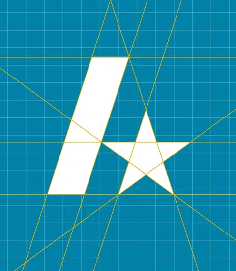
The identity took its cues from the story itself: a mark built around the geometry of the Star of David, subtle on first glance, unmistakable once you knew the reference, and a blue-and-white palette nodding to Jewish heritage and memory while keeping the system crisp and usable across packaging, web, and content. Not symbolism for symbolism’s sake. A brand that could hold history without becoming heavy-handed.
Then the work expanded from identity to growth, because in direct-to-consumer selling, the story is the targeting. Organic content built trust and community while paid campaigns tested which parts of the narrative actually moved people to act. Email became the long game: a relationship engine that turned the launch spike into repeat purchase and deeper loyalty. A live launch event connected people to the story in the room, with immediate sales and measurable lift across web traffic and social engagement.
Ten Boom didn’t just debut with a name and a logo. It entered the market with a narrative that could be carried, a visual system that signaled meaning without shouting, and a growth engine built to turn attention into customers and customers into a community.
Awaken with JP already had a strong point of view and a highly engaged audience, but the brand had evolved reactively, and the lack of cohesion began to limit clarity, scalability, and consistency across channels.
The work began with a deep dive into what made the brand recognizable to its audience, translating qualitative feedback into concrete data. Rather than surface-level messaging, the focus was the underlying point of view: what Awaken with JP stands for, what it challenges, and where it draws firm boundaries, formalized into a comprehensive brand framework and internal manifesto.
The visual system was refined to support recognition and cohesion. Not to neutralize the personality, to give it structure. In a category dominated by familiar palettes, distinct color choices clearly separated the brand from its competitors, identifiable without relying solely on logos or headlines.
The result: stronger internal alignment, clearer external recognition, and an identity built to support growth. The brand retains its edge and expressiveness, with the structure to scale, adapt, and remain distinct in a crowded, fast-moving landscape.
Your problem won’t be the first of its kind.
Bring it. We’ll tell you which system it needs.