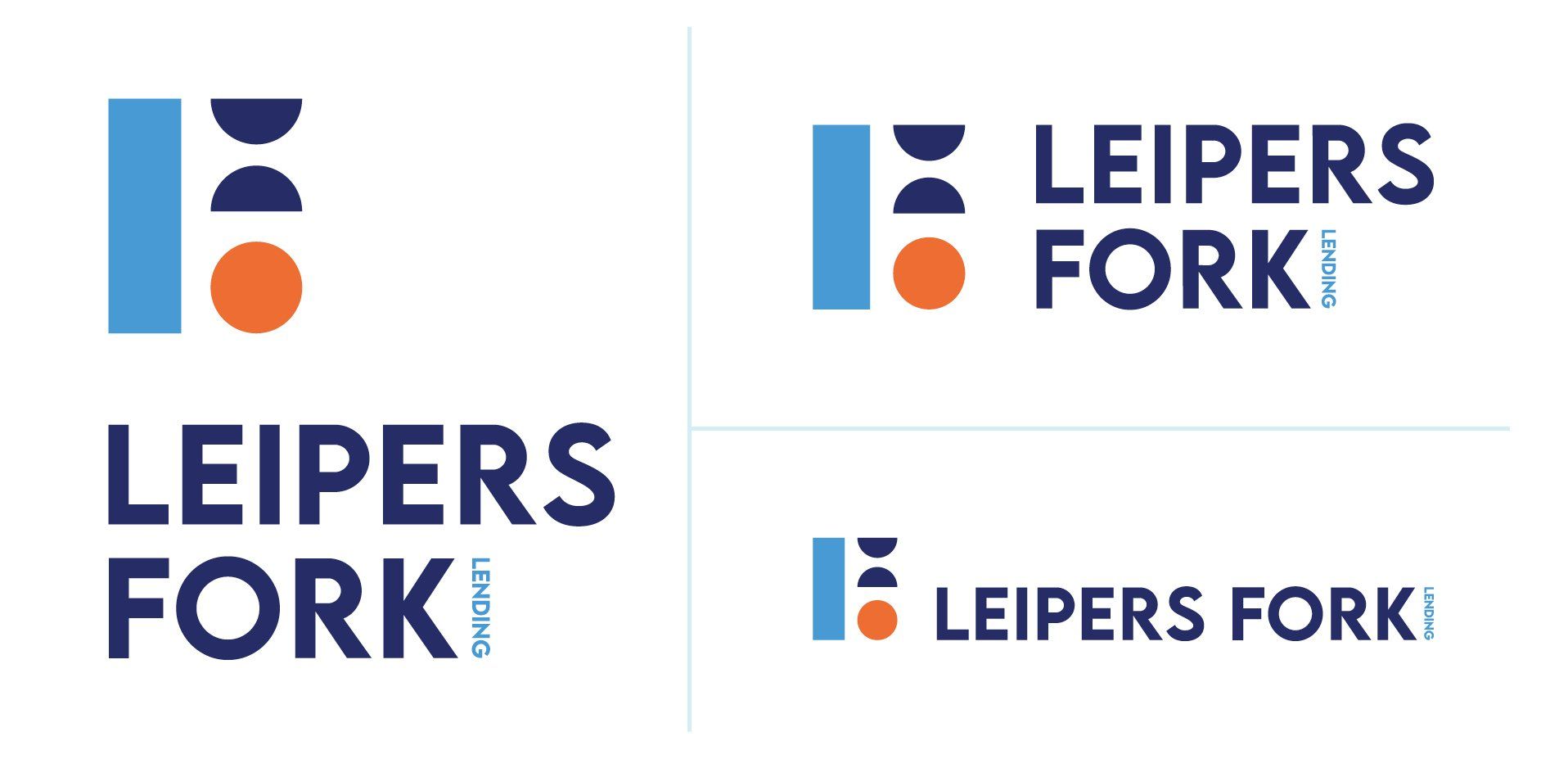
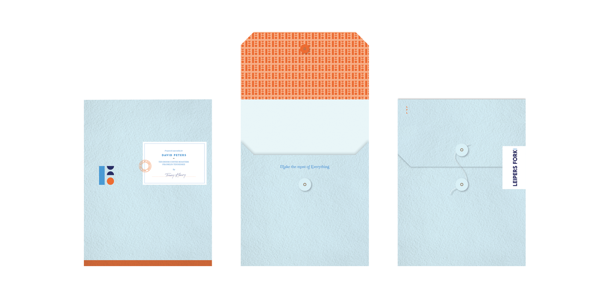
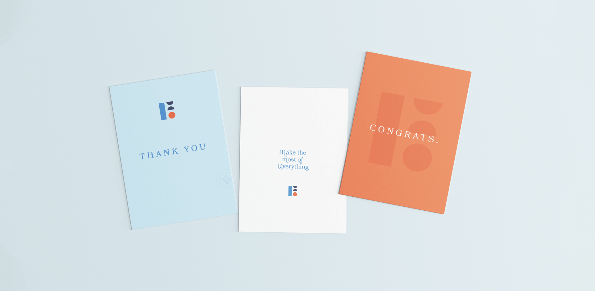
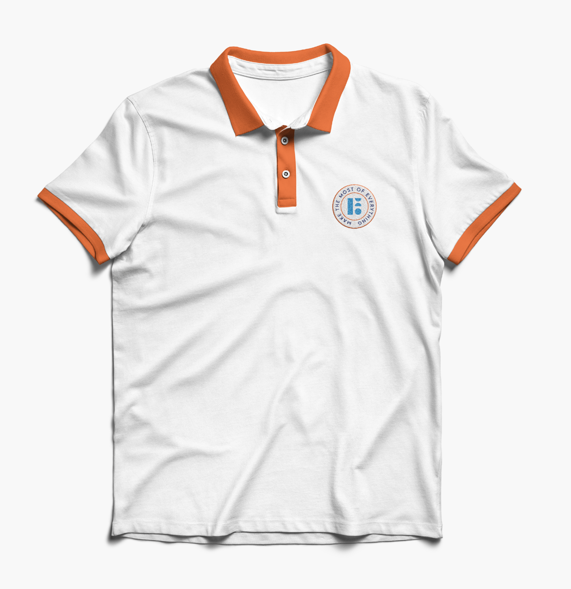
BRAND IDENTITY
DESIGN
BRAND STRATEGY
COMPETITIVE AUDIT
about this project
When Leiper’s Fork Lending approached us, they were new to the lending market. They had a solid business plan, a company name, and nine generations of family legacy in Leiper’s Fork, Tennessee. But what we wanted to provide for them was branding that inspired trust for both seasoned investors and those equally new to investment opportunities.

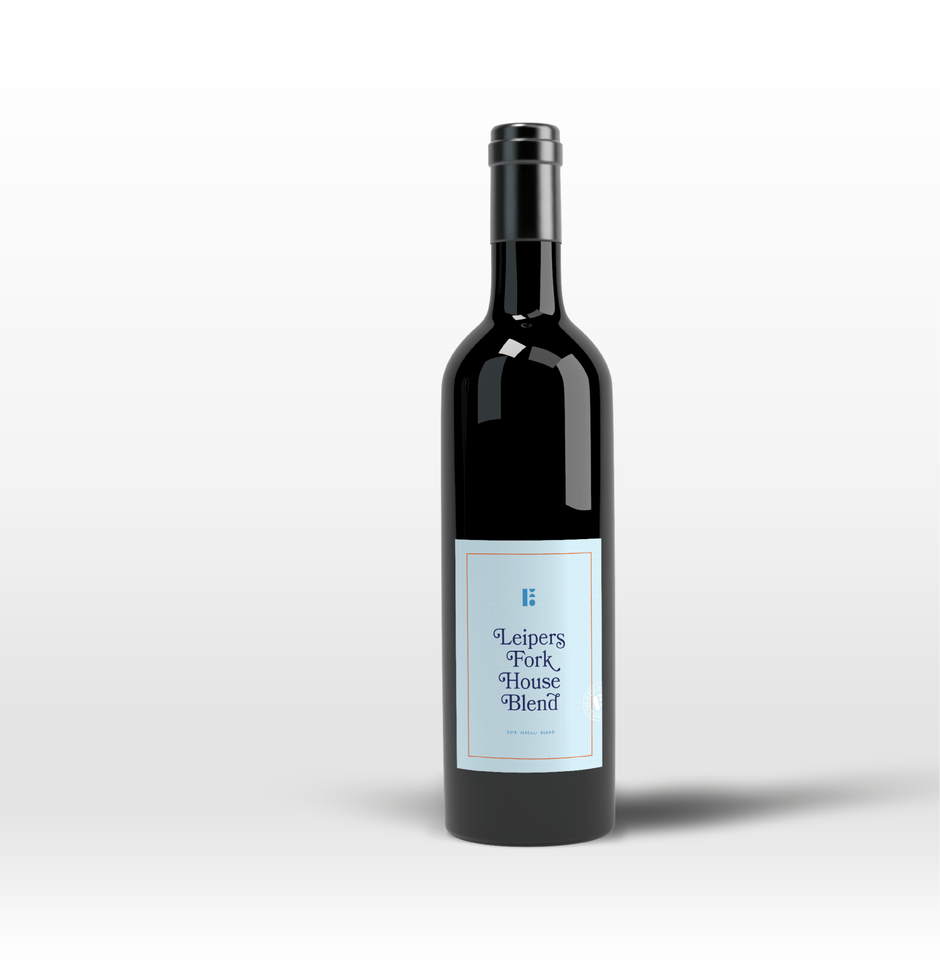
Leiper’s Fork Lending chose its name to pay homage to the community that raised their family for over nine generations. But paying tribute to their community goes past a name choice—Leiper’s Fork is a tightly knitted home grown community that exists outside the fast paced world of Nashville. Entering Leiper’s Fork is like stepping through a time machine into a somewhat begone era where everyone knows their neighbors and the pace of daily life is marked by hospitality and taking time to smell the roses. Leiper’s Fork is fiercely loyal to its residents and its homegrown businesses and is exclusive in protecting its nearly idyllic small town closeness.